Quorum

Corporate Site
In February 2020 I joined Quorum – a minute taking company; as a lead designer. My role was to establish a face to the company by doing a complete brand identity overhaul for Quorum.
To kick off the re-design, I interviewed the company owner to gauge: priorities, primary customers, requirements/constraints, her role as opposed to other employees and how the company ultimately measures success.
The key to a successful interview is simply to set learning objectives. To do this, I asked myself what two or three things I would have to extract from the interview, had I learned nothing else.
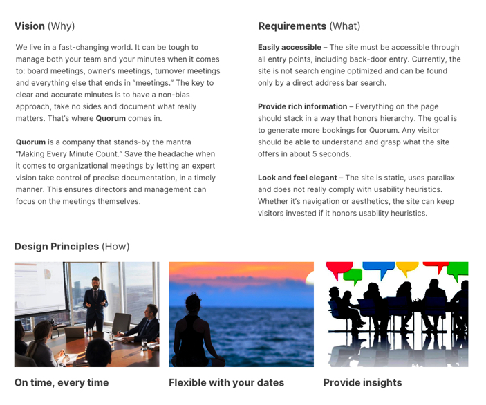
After the listening tour I comprised and condensed all of my notes into a project brief that would outline Quorum’s mission, requirements and principles. Like many early on user-centered design methods, this would serve as a guide to the design throughout its entirety.
To understand the ins and outs of minute taking and what a day as a minute taker could entail, I looked at existing competitors both national and inter-national.
Gathering this information from the competition contributes towards the designs of the project. This includes the user experience in what already works well with people and its design.
The discovery phase is the first phase in understanding the project goals, oppertunities for improvement and a finding the differentiators among competitors.
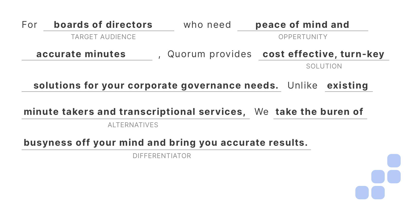
One of the many methods in the discovery phase that can help achieve this is the elevator pitch. I wanted something to swear by. Gathering Quorum’s target audience, services and values, I created the company elevator pitch for reference at any point during the design.
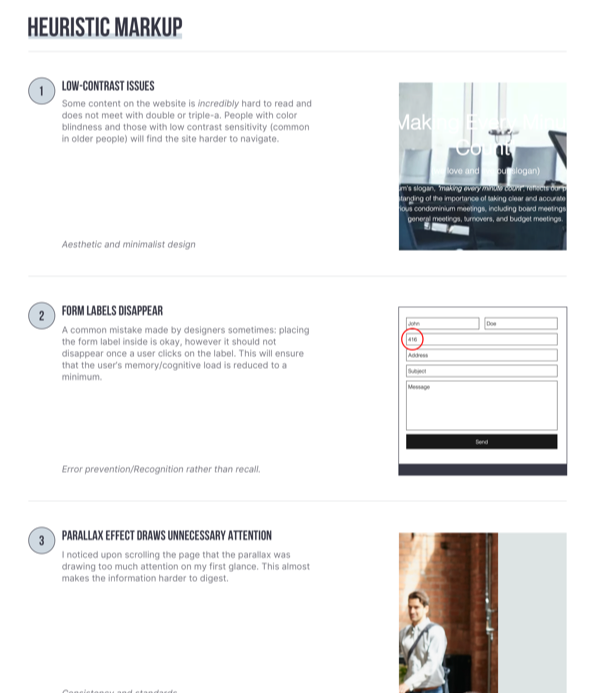
How does Quorum’s user experience feel from beginning to end currently? I performed a quick and dirty audit to see what parts of the site did not conform with established standards and best practices for websites.
Part of UX is to ensure that a product is familiar to those who are first-timers on a site as well as experienced visitors. I held a 5 second querrilla test with a couple people to see if they could understand what the site’s purpose was within 5 seconds of looking at it. The response, more or less was “some company trying to sell me something.”
These guerrilla tests were methods to grasp what I was working with. To put it into perspective, I made a list of heuristic violations the site employed to help the team understand why there’s not as much traffic as there could be. I then explained how tackling these issues will guarantee more traffic, and more leads.
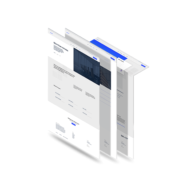
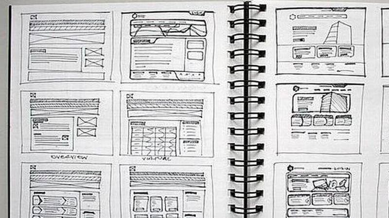
After gathering some introductory research to kick off the project, I created a rough sitemap with one of my favorite tools, Flowmapp.
The sitemap would serve as a “birds eye view” or “under the hood” view into the information architecture of Quorum. It’s important to dedicate as much time as possible into solid foundational research and sketches. This can ensure a north-star for the high-fidelity design comps, and can also receive loose, positive feedback.
To understand how I could design an easier service, I needed to look at the existing competitors.
Gathering this information from the competition contributes towards the designs of the project. This includes the user experience in what already works well with people and its design.
To understand how I could design an easier service, I needed to look at the existing competitors.
Gathering this information from the competition contributes towards the designs of the project. This includes the user experience in what already works well with people and its design.
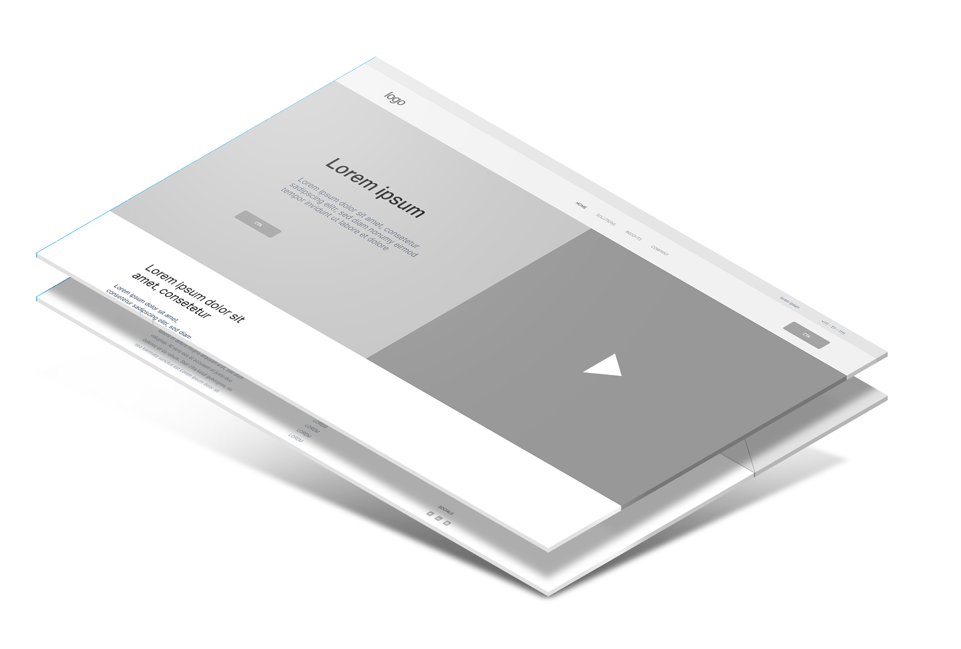
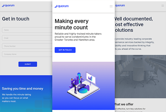
I created a demo for the Quorum team showing how their site would look on a mobile device.
The demo includes how each page is related to eachother and touches on how the animations will look. For this design I opted for Adobe XD as it’s quite easy to jump right in and create animations without the need for third party plugins or work arounds.
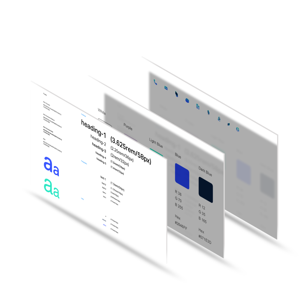
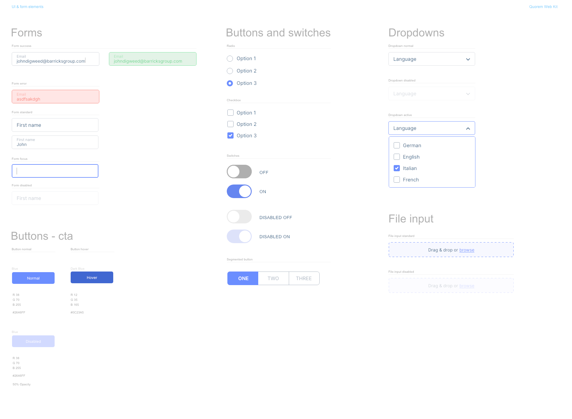
Creating UI elements is a case by case scenario. Rather than creating them up front, I created them throughout my entire design process for Quorum.
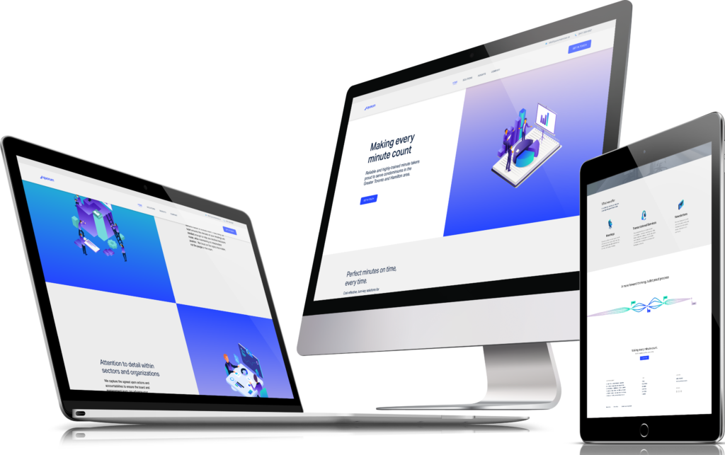
For the most part I use the same hue of blue to maintain consistency throughout the site that complies with Quorum’s brand. For the most part, the Quorum blue is used as an accent colour; whereas for “standard” elements, I would dial down the brightness and saturation.
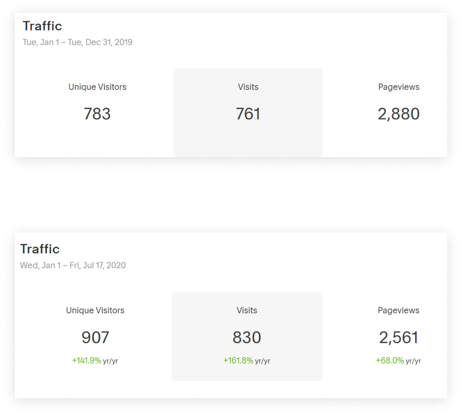
My work with Quorum was exciting and paid off when I showed the team the comparison of traffic between last year, and this year to date. Using a user-centered approach allowed me to harness every aspect of the design. My biggest take-away from this project was that: even without a team of partnering researchers and designers; the same methods still apply, just on a smaller scale when it comes to UX teams of one. Here are the results from the site re-redesign:
141.9% increase in unique visitors this year to date compared to last year
161.8% increase in visits this year to date compared to last year
68% increase in page views this year to date compared to last year
15% increase in source visits via Google this year to date compared to last year