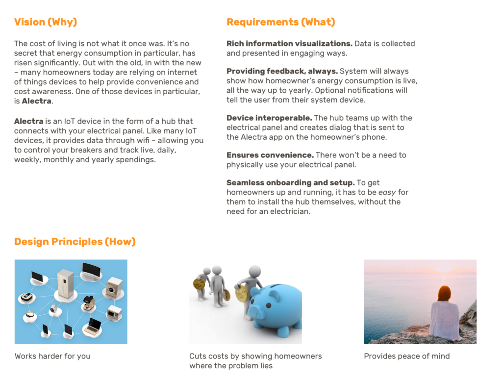
Alectra
Mobile application
We spent two months working on a real-time, iOS application that allows homeowners to manage their energy consumption, and access their circuit breaker from anywhere – without the intimidating face-value. This was an exciting process from start ’til end.
Early on in discussions it’s common for teams to express ideas about what the outcome might look like at any point during the project life. More often than not, people have very different ideas about what they expect to see.
The project brief is best kept short so people actually read it. It’s important to know that you always reserve the right to tweak it as well. We created the brief with our best guesses in the discovery phase. Venturing into the research phase would prove whether we need to tweak the brief or not.
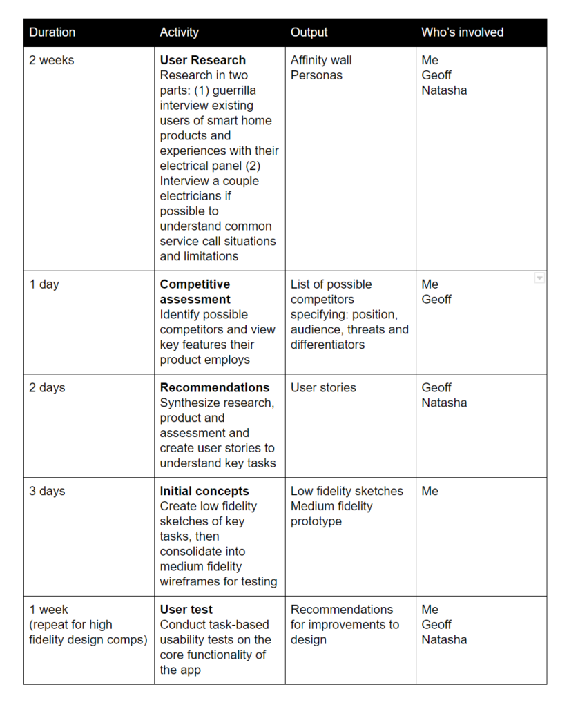
Not to be confused with an overall project plan, the UX plan was created early on to outline methods that will be used throughout the product’s timeline and iterations. The UX project plan helps to guide and steer the team when there’s a project that is likely to span for weeks, months or even longer.
What was especially great about the UX project plan was that it allowed us to be honest about how we were going to tackle the work when let’s face it, sometimes you aren’t sure how you will. We outlined our methods such as: interviews, competitive assessment, concepts, design comps and user testing.
Defining these methods after acquiring goals set us up for long term success. The discovery phase is the first phase in every project and its purpose is just that – a guiding north star.
Every project starts with research. We began by pin-pointing what features and benefits users would need out of an electrical panel app. The product would have to be recognized by both professionals and homeowners.
We created an interview protocol and interviewed two electricians in a semi-structured form. These interviews were to figure out what were the common causes of service calls when it came to homeowners’ electrical panels. The interviews also helped gauge what other possible features the app could have other than just turning a breaker on or off.
Our interviews with Mr. Anthony Tibora and Mr. Matthew Zeppieri allowed us to understand requirements, constraints and other tidbits about the electrical panel world.
Here are some important pieces of information we got from the interviews that would help shape our feature scope:
– Often received calls about issues with their breaker. The electrician would then troubleshoot the problem and all the home owner had to do was flip the breaker on and off, costing $150 for the electrician’s time
– Homeowners would ask how they can keep their power bill low
– Have shown interest in a product that can help them manage their spendings and control their panel from their phone
– Homeowners would not want to get hands-on with their electrical panel
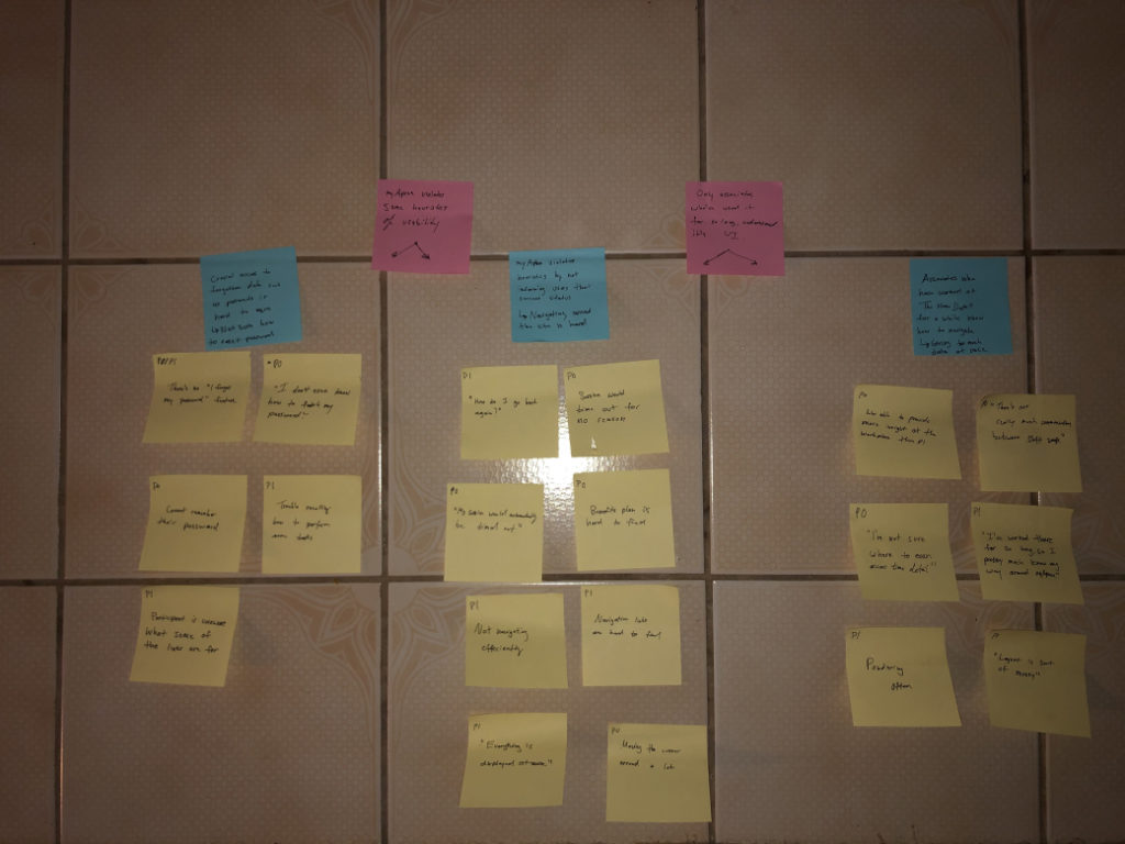
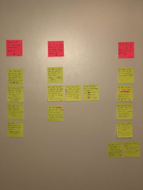
After the interviews we listened in and jotted notes on coloured stickies in order to create an affinity wall. The affinity wall would serve as a reminder to what current issues there are with electrical panels, and how Alectra can solve those issues for homeowners.
The goal of the affinity wall was to consolidate our research findings we extracted from our interviews. The row of stickies at the top was an indication of common themes from the pain points which we used to categorize our how might we statements.
Outlining the how might we statements would eliminate potential issues further down the product design cycle. The reoccurring themes we discovered were: home owners found their electrical panel unapproachable, they mentioned how tedious it was to track consumption/spendings and unawareness of breaker trips.
Based on these themes, we broke them down again in order to place ourselves at the beginning journey when a user would think these issues.
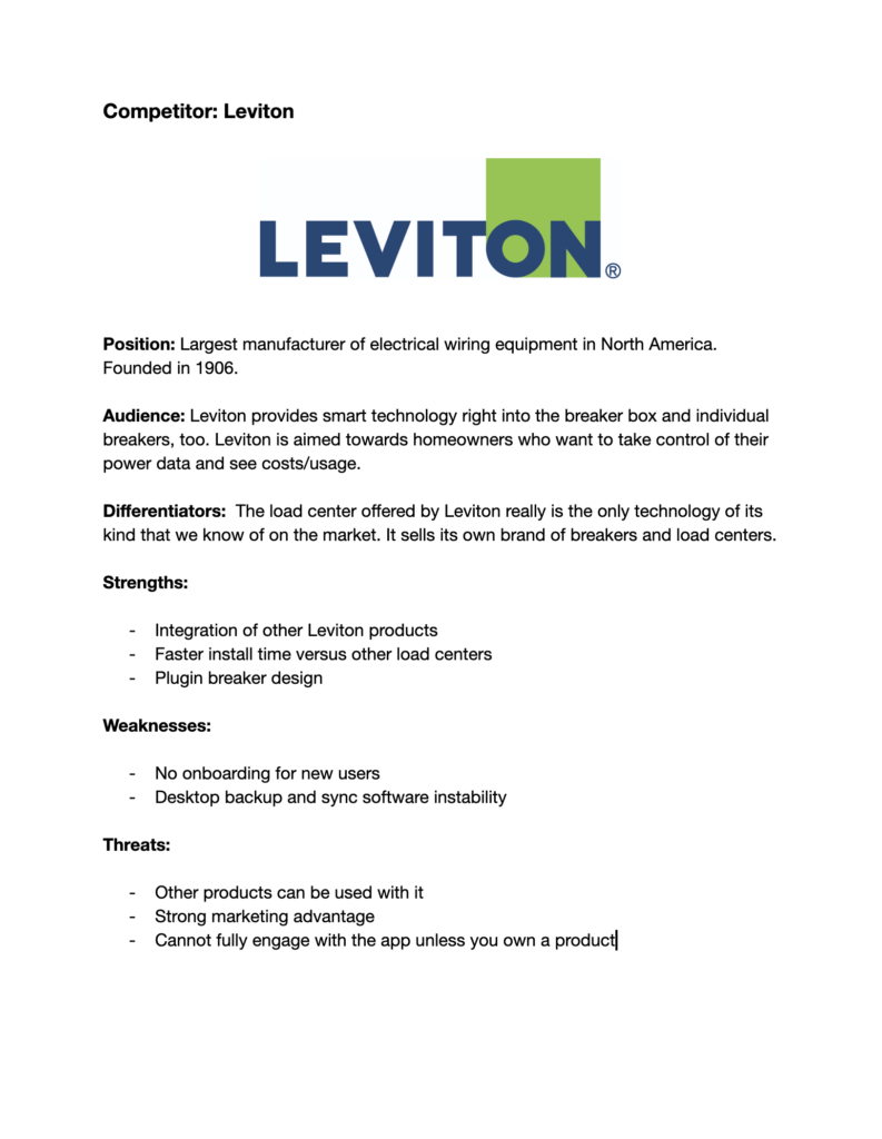
Looking at existing competitors and conducting a competitive analysis was a method in the early stages that helped us understand how we could build a better experience.
Leviton was the only competitor in our view that offered a similar service. The threat, though, is that Leviton offers many kinds of products that can all be managed, in one app. Such products are: fans, dimmers, plugs and switches.
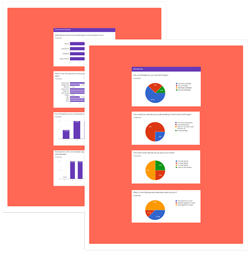
We opted for a quantitative survey and distributed it on reddit/IOT. Here are some key points we learned from those with IoT devices:
– 55% of people value energy efficiency as most important when it comes to IoT devices
– If IoT devices aren’t convenient and providing value then there’s no point of using them
– View their usage on the provider website or wait until a paper form arrives
– 44.4% of participants consider having their home work for them as extremely important, while the remaining found it of lesser significance
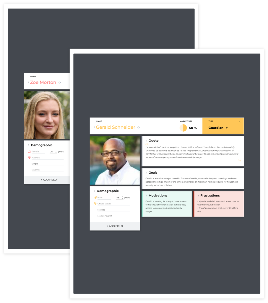
After we had finished with the interviews, surveys and storyboards, we had created two personas to guide the design so we could always reference back to who we were designing for.
The two personas were not something we had created just at that stage, but it was something to look at even closer to the end stages.
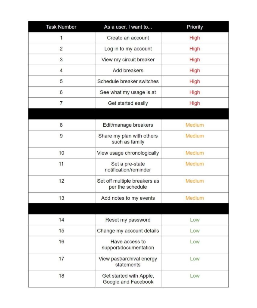
The next step in our process was to create our user stories.
User stories help focus on the minimal amount of features a service would need to ship out the product.
These features would apply to both new and returning users. A starting list of features range from logging in, to creating an account, to assigning breakers etc.
Having reference to user stories allows us to focus on the important features using the 80/20 rule. The Pareto Principle indicates people use 20% of things, 80% of the time.
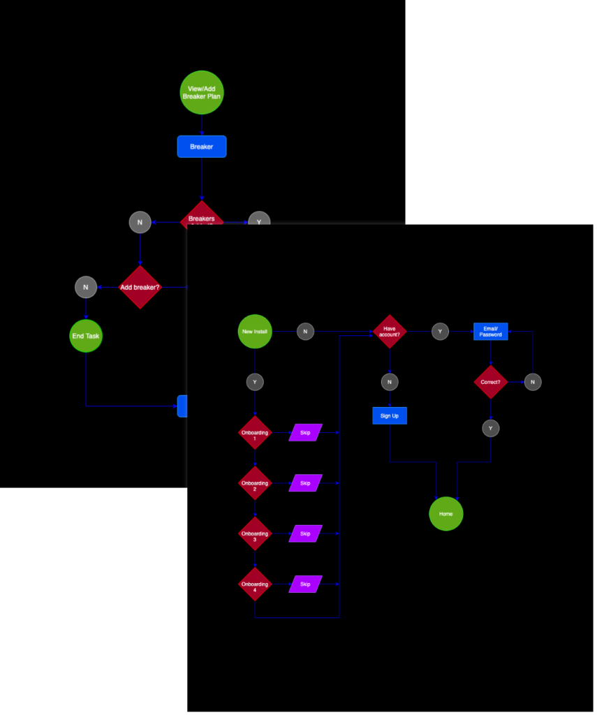
Using flow charts show an overview of the steps needed for a service feature that will be in the platform.
The two personas were not something we had created just at that stage, but it was something to look at even closer to the end stages.
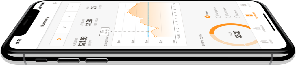
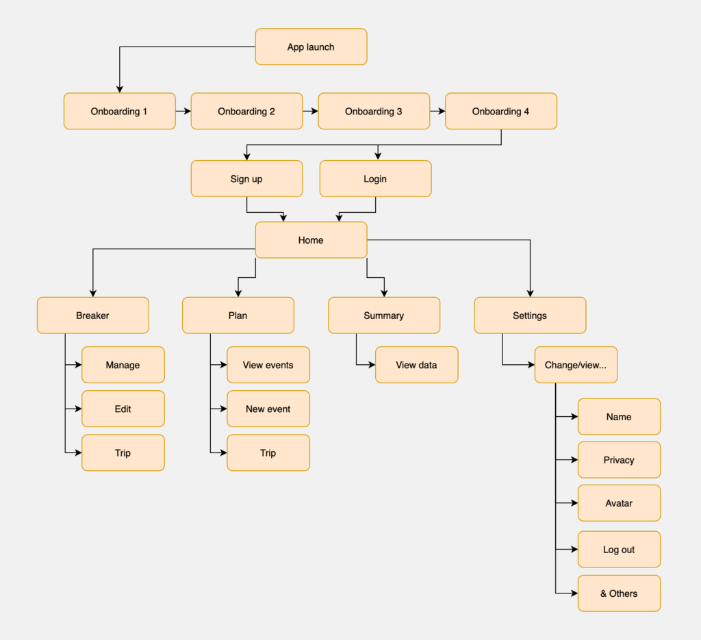
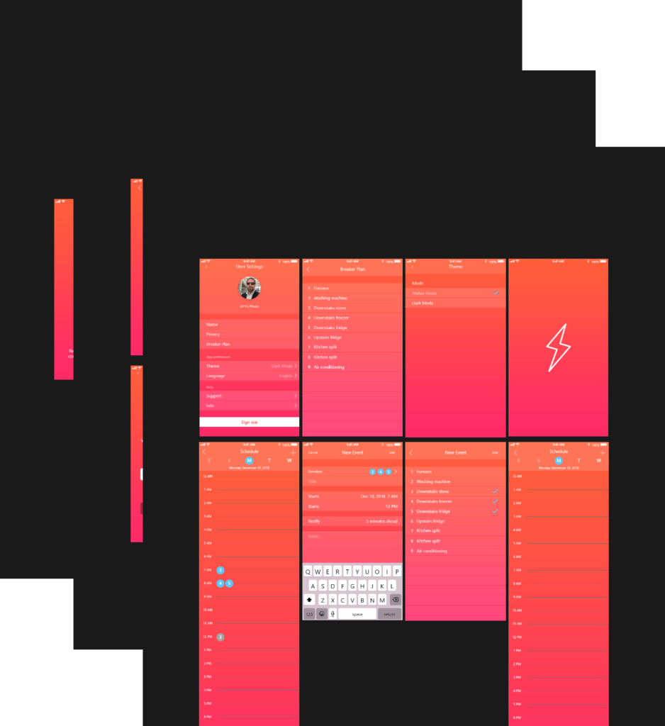
After creating some key task flows, we had made the sitemap for Alectra. By creating the sitemap, we were able to keep track of which screens to design. App launch and onboarding are the leading screens up until the user arrives at the Home page. The Home page then becomes the top level in the app hierarchy. Most pages users can dive deeper into however Summary, for example, is meant to view your spendings and consumption in relation to: live time, hours, days, weeks, months and years.
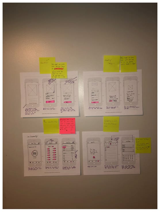
After brainstorming potential task flows and information hierarchy, we drafted some low-fidelity wireframes with pencil, stickies and marker to kick off the design phase.
Before committing to digital wireframes, we made sure to sketch out what the core functionality of the app would like like. It was important at this phase not to design the ocean, but only the key features of the app so that it could guide states, modals and alerts when it was time to ramp up the detail.
After the sketches, we created wireframes with XD. These wireframes use the compiled research towards the product mockups. This step also allows us to establish a foundation for our design direction.
Prototypes allow us to interact with our product for testing. We also get to see the project decisions come to life.
This prototype represents what a users experience would be like from onboarding to dashboard. What was great about this stage was that we were able to collect more research to iterate over again.
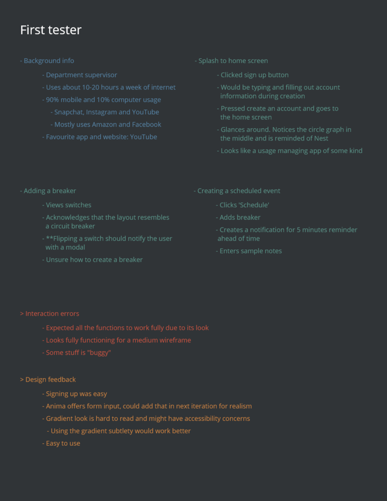
Our product now needed insights from real people to make sure we’re on the right path. To gather insight, we conducted usability tests. The usability test gathers insights from users’ feedback towards the design prototype.
The testing also aimed to better understand participants’ behaviors for the designed mockup. We used usertesting.com, a fast solution to finding participants for the test. We created a screener in order to test our target audience who inherited qualities of smart home users.
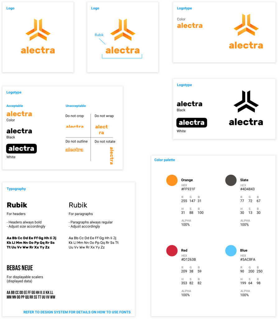
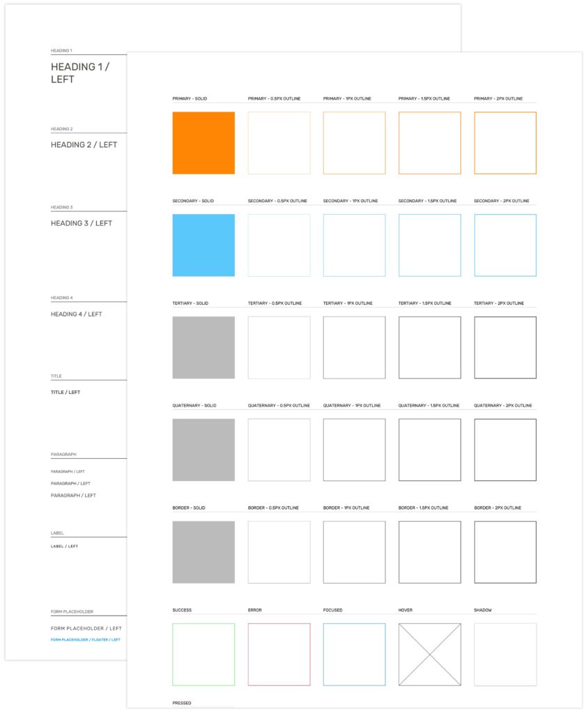
Alectra is a solution to circuit breakers and electricity usage. To maintain a friendly brand identity, we chose Rubik as our main typeface and Bebas Neue for scaler elements.
The app is mostly made up of its primary orange colour. There are moments where we use blue mainly for links. Our medium-fidelity prototype appeared to have too much colour and so we dialed back and established a style guide to base our MVP off of.
We went back to the drawing board with our colours and fonts as there were some accessibility issues. Many of the issues from the initial prototype stemmed from lack of usability and visuals.
We prepared for our final iteration by establishing a design system that contained in depth: fonts, colours, borders and shadows. We also decided that we would remove red as one of the potential brand colours as it made the first prototype UI too vibrant. Considering error states are red, we simply used the same colour and applied it to the app error states.
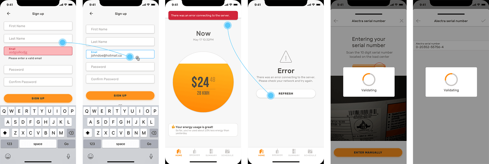
What might the screen display to the user when something like a network error, invalid form entry or empty form entry happens?
As I designed screens such as the onboarding, instructional process, and form inputs I made sure to also design their corresponding multi-state screens. Such screens contain what the error would look like, one for: if the current screen was cached and one for: if it was not.
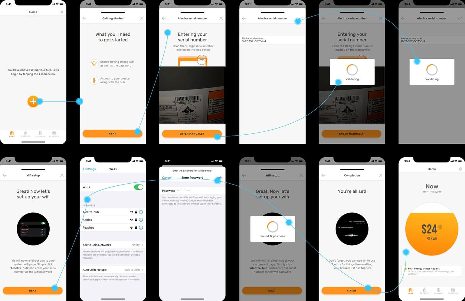
When the user opens up the app and has not set up their hub, a floating action button will be displayed on all pages of the app located in the tab bar. This is because the hub will have to communicate with the breaker and device in order to display information. The settings, however, can still be accessed; as information such as: account email, password and preferences will be stored there.
Multi-state screens
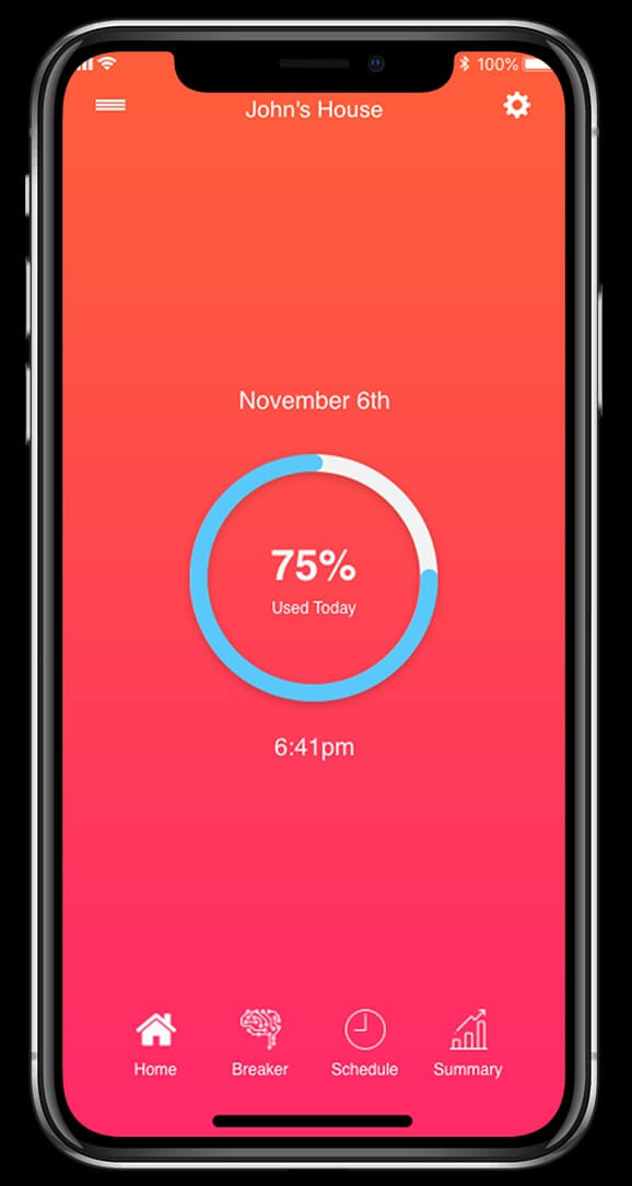
The way an electrical panel looks and the way we interact with it has not changed for decades. Alectra makes your electrical panel approachable, attractive and have smart technology capabilities – something most owners want today.
Each breaker connects to the homes wifi system, making it easier than ever to track your usage the moment you download the app.
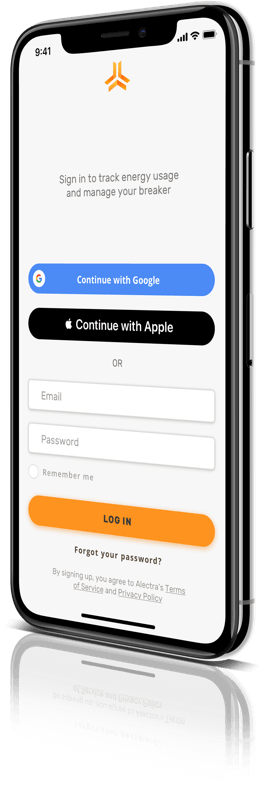
Every home owner will recieve a hub with a unique serial number that easily connects your electrical panel. Once the mobile app is installed for the first time, users will have to complete a simple onboarding process in order to take full advantage of the app. This includes: editing/adding/deleting breakers, managing usage, creating a time for activation and more.
Device setup
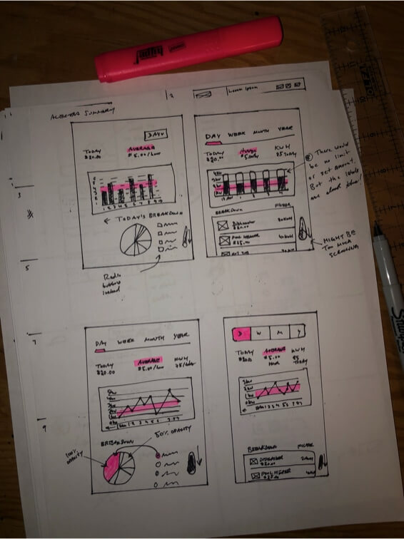
Bar graphs, line graphs and pie charts. These, no doubt, can sometimes be a big pain to create. Before getting straight into design, I recommend drawing them on paper with a pen or pencil. This is so that they can receive open criticism, and are not limited to attachment.
Choosing the right graph depends on what kind of data you are showing the user. Line graphs are an excellent way to show data changing over time in small increments, many times. Bar graphs, are great for showing big change over time, but not as many times as a line graph would. Pie charts, while not popular, are great when teamed up with a bar or line graph. Not on their own. These are great for showing portions of data that can be broken down into categories.
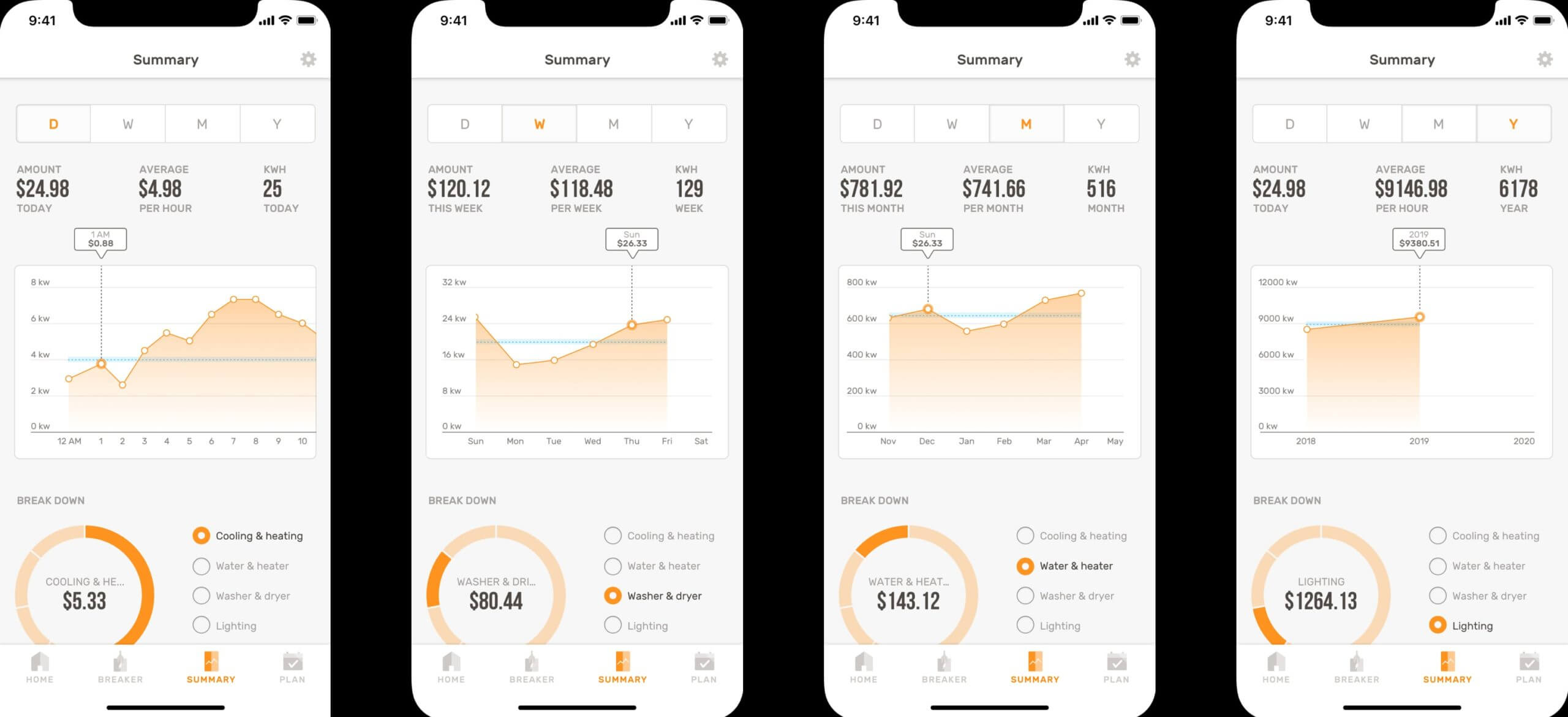
For the summary section of Alectra, I chose a line graph as data is constantly changing every second, minute, hour, day, month and year. Users can touch and drag on the graph to see their previous data in time. Below is a pie chart which shows how much energy each category consumes for the selected time period in the segmented button. I have used a process called ‘binning’ for the pie chart to keep it as user friendly as possible. This is the process of grouping slices that are too small, into their own category, often into a category named “Other.” This could be for any amount of slices that take up, say 10% of the pie chart.
Summaries
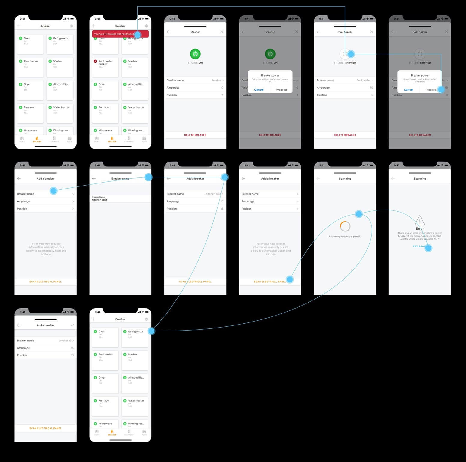
The breaker page on the app shows all circuit breakers live on the electrical panel. Each breaker emits a signal in order to provide a default placeholder upon breaker deletion.
Homeowners can easily turn their desired breaker on or off in the event of an outage. A warning message is always displayed before switching it on or off to remind the user the decision they are about to make. Error messages can appear if a breaker has tripped, but they can also appear when scanning fails as a user adds a new circuit breaker.
Breaker layout
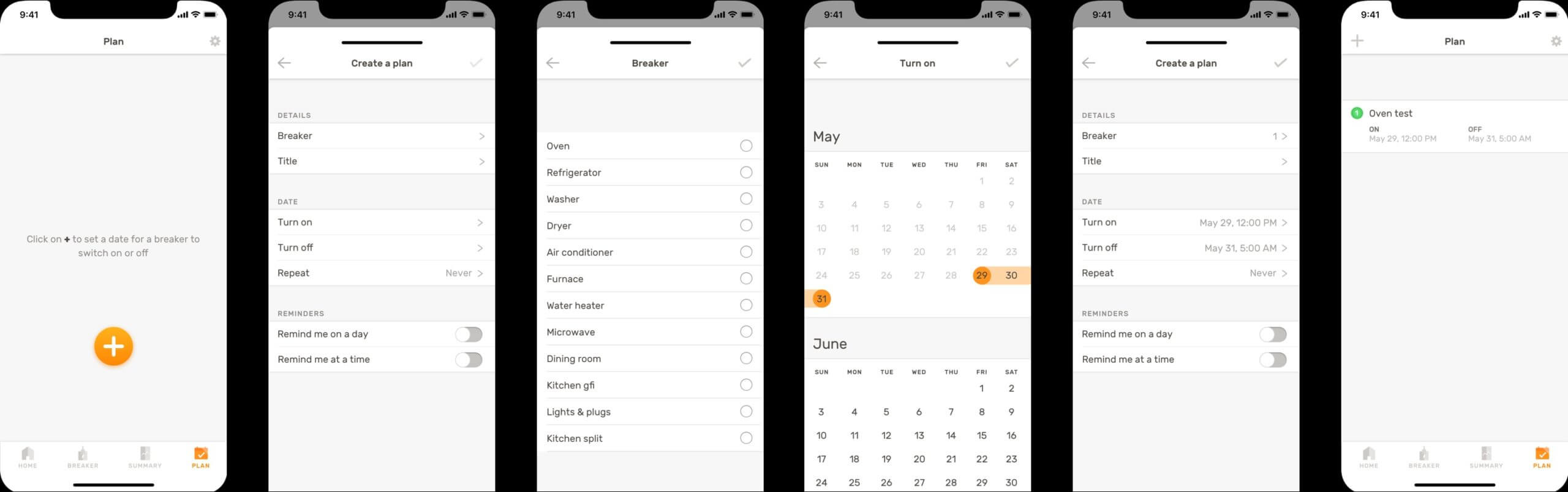
A floating action button will appear if no plans have been made. Plans are a time at which you can set your breaker on and off – like a scheduled timer.
When two dates are selected, a drop down will appear to specify the users desired time of the day when the breakers will switch on or off. Once a plan has been created, it will be added to the ‘Plan’ page where the floating action button has now disappeared. Users can also swipe from right to left as they would most apps, to delete something.
Plan
To cap it off, we conducted one last round of basic usability testing to see what could be improved in further iterations down the road.
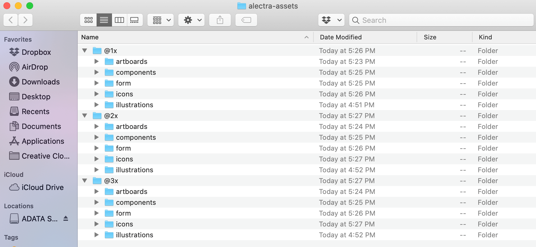
The last stage was to organize the assets in a way suitable for easy hand off to developers. The folder assembled for hand off includes static assets as well as the Sketch file. For reference, a link to the Flinto prototype can be found as well so developers can view micro-interactions.
Assets are organized by @1x, @2x and @3x for neat file structure. Beyond the export scaling, folders for the art boards, components, form elements, icons and illustrations can be found – all in lowercase letters.
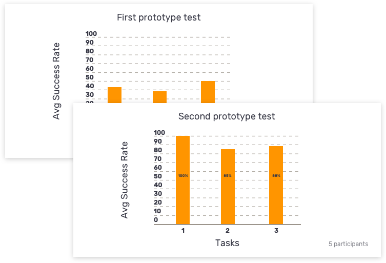
Our last usability test helped identify that we had made improvements since the first test with the first prototype. We used the same method which was usertesting.com and recruited 5 participants for the test.
Our main UX metrics were: average success rate for each task and success rate measured by user, per task. We were happy to see an increase in rates compared to the first round of testing which was the factual evidence we needed to reflect improvement.
We included quotes (both positive and negative) in the report as well to serve as qualitative information. These factual statements made by our participants helped us to cover areas we may have overlooked. Time permitted, we would have liked to consider more UX metrics for further iterations of prototypes and usability testing such as: error/confusion rate and subjective satisfaction. However, we measured on the same metrics as the first usability test so we could directly compare the old and the new.
“The polished details gave me the impression the test was an actual site. The prototype was too polished for it to be a rough version that I didn’t treat it like so.”
Through the testers, I realized the visuals on the prototypes did not fall short. Rather, the visuals were too polished for the first interactive prototype. This lead testers to treat the prototype as a working service due to the polished visual. The polished visuals for the prototype would be better appropriate in later designs.
Despite that, all visual elements changed throughout later phases. I’ve learned it is more crucial to first have a strong foundation design. Given with a new project, I would start to label and create organized file structure from the start. Doing this allows packaging the project during development hand-offs. It was surprising to me how time consuming file organization can get. When the assets are not labeled, this can become a headache when searching for them in later time. Iterating the visual designs can always improve after.