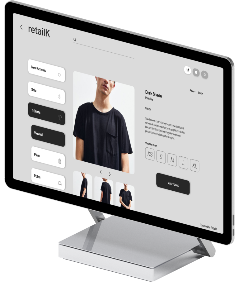
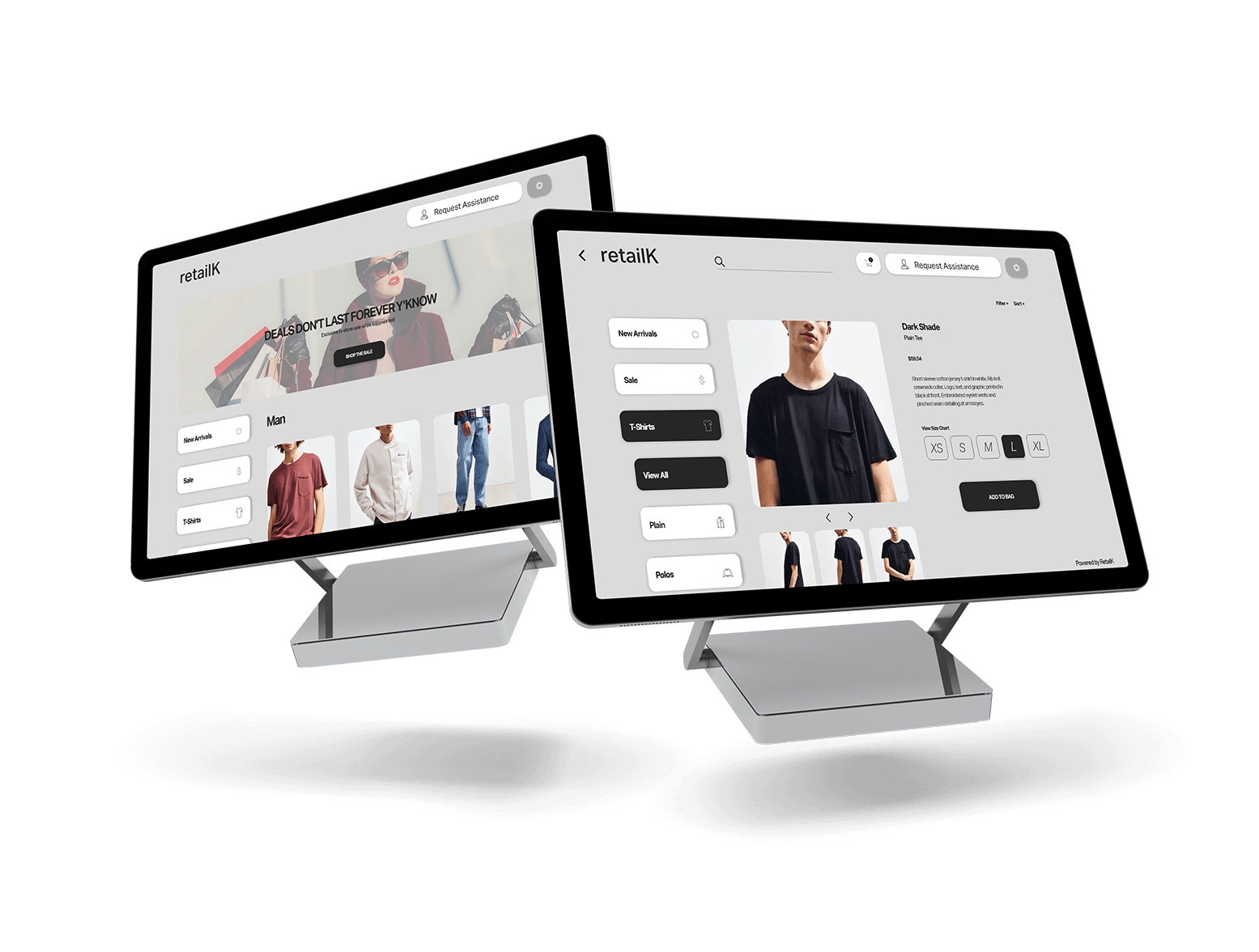
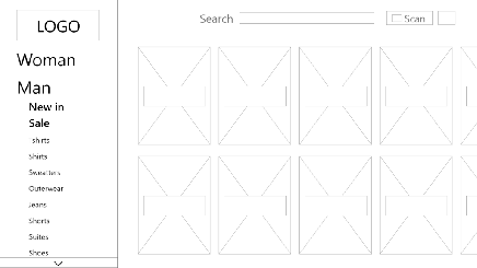
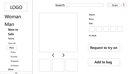
RetailK

RetailK —

Kiosk Interface

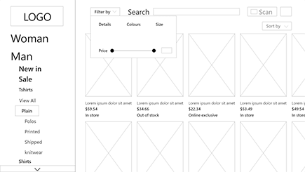
Introducing the first kiosk that eliminates the tiresome change room experience at brick-and-mortar clothing retailers.

Problem Statement

Consumers find the fitting room experience tedious and the process of product discovery cumbersome.  

Proposed Solution

A kiosk system that allows customers to reserve a fitting room from the shop floor and request for assistance within their fitting room. While the customer is in the fitting room, they can request alternate sizes and styles using the kiosk within their room.

Roles

  • User Research
  • Visual Design
  • UX Research
  • Personas
  • Prototyping

Deliverables

  • User Surveys
  • Personas
  • User Stories
  • User Flows
  • MVP

Team

  • Abdul Renaldy-Pierre (UI Design)
  • Nina Paul (UX Designer)

Competitive Analysis

We began RetailK by conducting contextual research. utilizing the POEMS framework. Before getting an idea of what we were creating, we needed a deeper understanding of the consumers that will be using our product.
We placed ourselves at a nearby Aldo’s and took notes on the overall context of the atmosphere, since our product was aimed for clothing retailers. With the POEMS framework, we were able to identify several factors that define a common shopping experience at a clothing retailer.  

Understanding Users

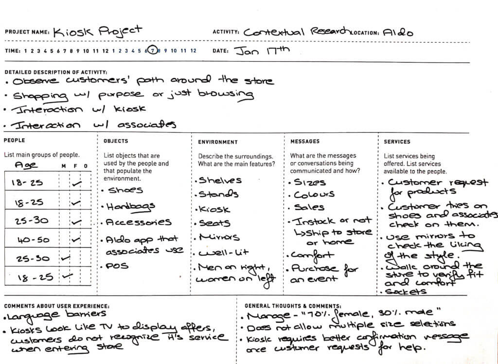
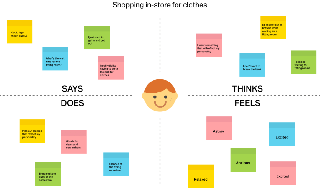
Statistics show that 9/10 shoppers are unsatisfied with their fitting room experience. In conjunction with our contextual research we had conducted, this statistic was a clue to how we could flip the negative fitting room experience on its end. 

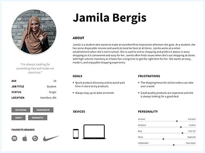
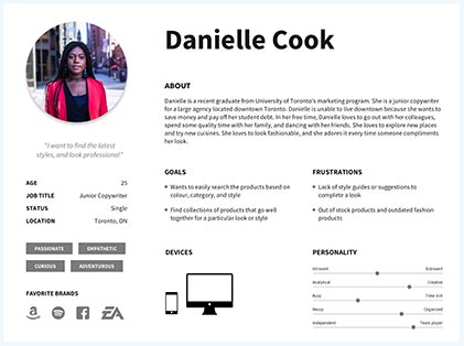
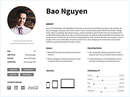
We designed RetailK with two targets in mind: Established Professionals and Young Professionals. These are clients between the ages of 25 and 66 who are independent, resourceful and value their freedom. Another target market in our view is the Upcoming Professional – those between 16 and 24 who have never known a world without internet, and are familiar with rapid-growing technologies.

Before jumping into our personas, we created an empathy map to establish a common ground among our team. As a team we brainstormed how the average consumer would react to an experience such as shopping for clothes inside of a store. Our empathy map was a method that functioned in tandem with our personas as a Classic UX approach to solving problems.

The Scope

After gathering resources from our research, we had created three personas to represent the needs of our users. Now that we have users to guide the design, we had created a scope to guide a seamless-experience. Here is the scope as follows:
  • The kiosk will have an in-built product scanner for customers to review product availability and size/styles
  • Users will have the option to browse an online catalog
  • The kiosk will support multiple languages
  • Users will have access to their session’s browsing history
  • Users can sort and filter by size, colour, features and newest additions
  • If the product is available in-store, users will have the option to request to try-on the product from the kiosk
  • The user will have the option to request multiple sizes of the same product to try on
  • If the merchandise is out-of-stock, the customer will have the option to find the closest store that carries the product or the option to ship the product to their residence, office, or local store for pickup
  • If the customer calls for assistance and a representative has accepted to help, the kiosk will display an image of the representative and their name
  • If the customer is unsatisfied after trying on the product, they will have the option of either requesting assistance within their room or placing a request for an additional size or style of a specific product

Usability Testing

Once we had completed our low-fidelity mock-up, we were ready to proceed with usability testing. Our users were asked to play the role of a casual consumer at a retail clothing store. We began user testing with a pre-test questionnaire to get an idea of how our users generally will go about the in-store shopping experience. After our users had filled out the pre-test questionnaire, our team prepared a task list.
    Task 1

  • Imagine you’ve walked into a department store, and you’ve picked 2 jackets in a Medium size that you would like to try. Your task is to scan both the items, after scanning each item you would deposit them into a box next to the kiosk, and then provide your contact information for the system to notify you when the trial room has been prepared.
  • Task 2

  • You have a shirt in mind that you saw on the department store website and want to come in and try it for yourself, how would you go about using the kiosk to reserve a changing room in order to try it on?
  • Task 3

  • You get to the kiosk and notice someone had been using it, how do you reset the kiosk back to the splash screen?

Findings

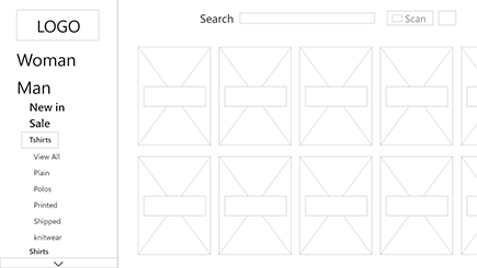
After our usability test, thanks to our participants, our team was able to identify six issues with the kiosk. Each issue was ranked with severity.  Whether it was a low or high-priority issue, we made sure to tackle these issues. Here are the six issues as follows:

  • 'Fitting Room' is a more-common term in Canada than 'Trial Room'
  • On the Fitting Room review page, users with accessibility needs should have options
  • Visual and textual guidance to help the user move screen tp screen, confirmations are also required.
  • Often customers will leave the kiosk on after they're finished. It was unclear where the user should go to exit or reset the session
  • On the confirmation screen, users need to know how long they're waiting, and their place in queue
  • The shopping cart only shows the price of the itme itself, but does not show the total

Bringing everything together

To wrap everything up, we compiled all of our research findings and steps into a report.

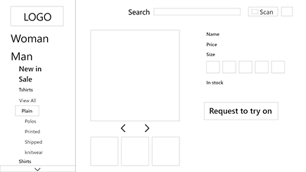
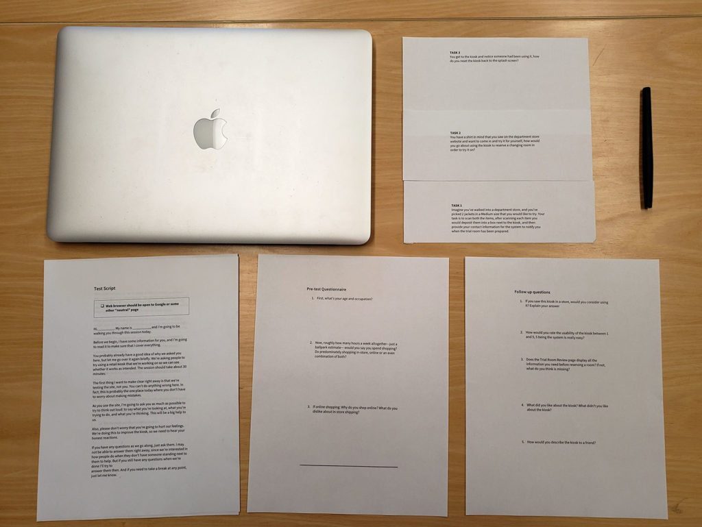
Iterating each time on findings with the over-arching research questions in mind is a fundamental way to create a  great product for users. When it came to user testing, we found that most of the participants thought they were using a fully functional kiosk.


That, along with other suggestions can be found in the report that could be implemented given another round of testing.

MVP

Once we rectified the issues with our kiosk, we created our minimum viable product.